
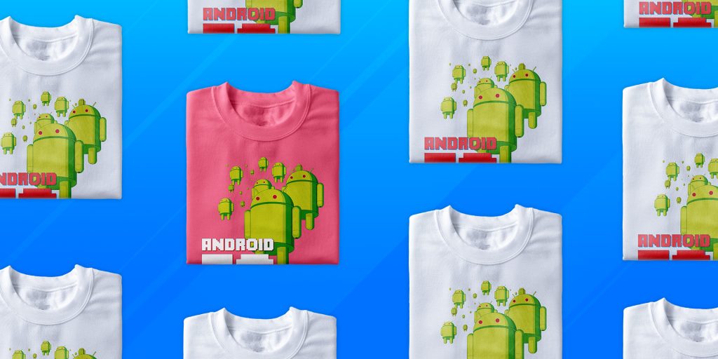
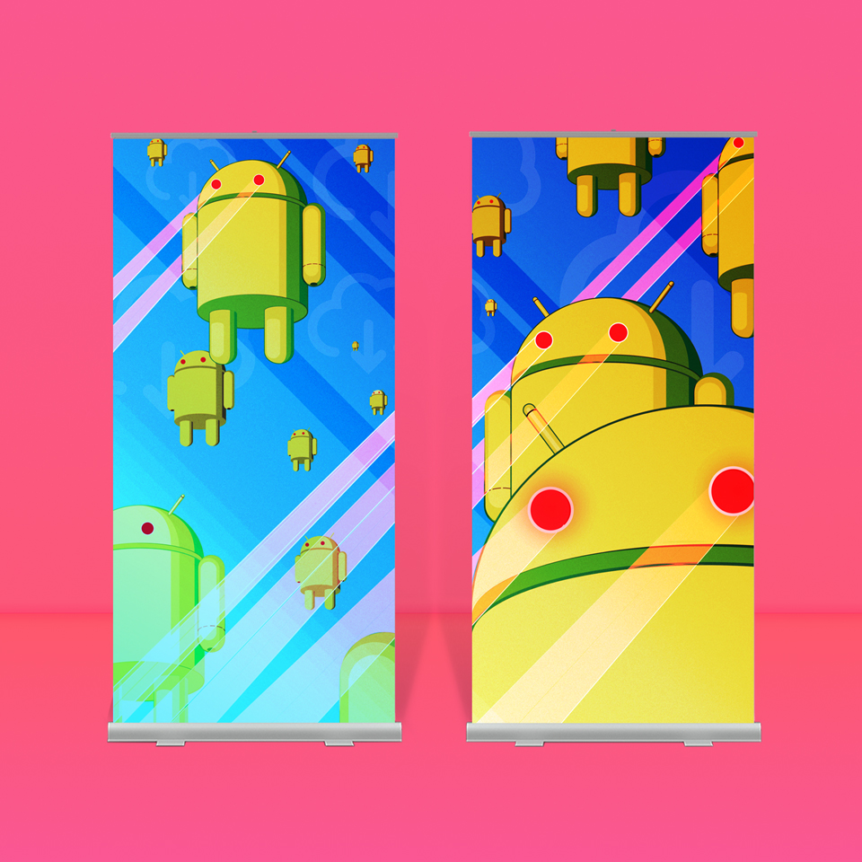
The AndroidTO 2016 event identity was built as a complete system. Posters, lanyards, banners, and apparel, all designed to carry the theme across every touchpoint.
Pixel Dreams developed a complete visual system for AndroidTO applied across every part of the event from large-format signage to wearable pieces and digital touchpoints.
Senior Designer Mark, brand new to the field at the time, was assigned the simple brief: build something bold, scalable, and cohesive across all formats.
The result was a unified system that carried the same visual language across:
- Posters
- Pull-up banners
- Lanyards
- T-shirts
- Event graphics and digital assets
When the event went live at the MaRS building, it looked like a takeover. Mark saw a complete system he designed fully realized in the real world for the first time.
Building the Visual Language
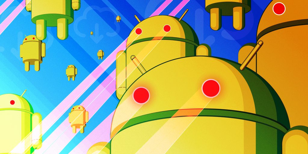
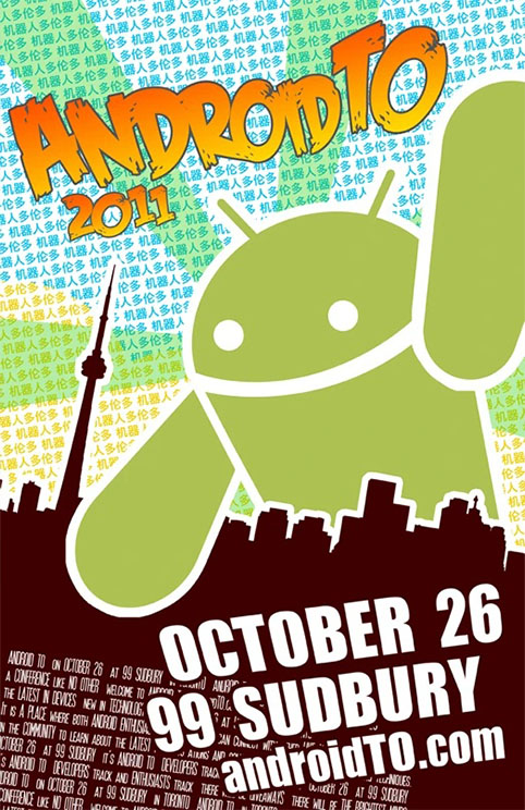
The 2016 identity began with a clear reference point: the iconic AndroidTO poster from 2011. Its sense of scale, depth, and destruction created a world for the 2016 concept to inhabit. The single, towering force of the original design gave way to a field of Android figures raining down from above, firing lasers across the city. Echoing the rise in popularity of the Android mobile operating system, the 2016 concept turned a singular moment of impact into a sustained sense of invasion.
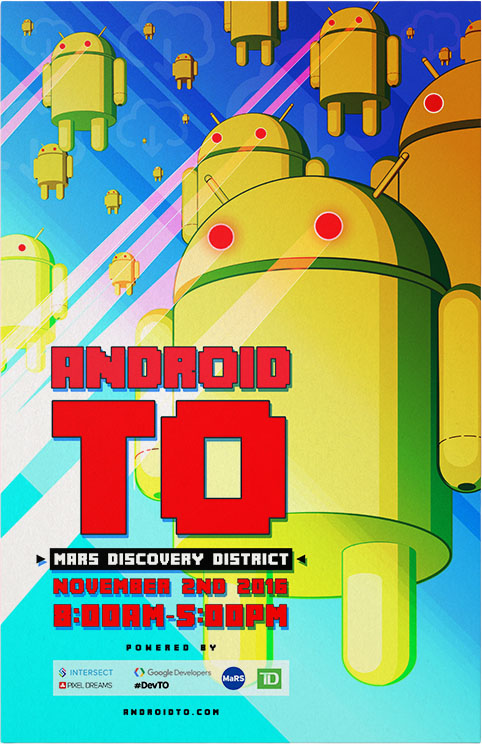
An endlessly repeated Android figure created density and scale. The composition expanded easily across formats. Heavy overlays, bright tones, and layered effects helped the visuals to stand out in a crowded environment.
The result was a cohesive system that carried the direct, exaggerated, and slightly chaotic energy of the event.
Explore more event identity and environmental design work from Pixel Dreams: